Definition
The backdrop-filter CSS property allows you to apply filters to the background of an element. This can be used to create interesting visual effects, such as blurring or color shifting the background.
Syntax
.glass {
  backdrop-filter: blur(18px) saturate(1.3);
}
Values
- Same function syntax as
filter(blur, brightness, etc.) but applied to content behind the element. - Multiple functions can be chained.
Practical Examples
.glass {
  backdrop-filter: blur(18px) saturate(1.3);
  background-color: rgba(15, 23, 42, 0.45);
}
Backdrop filters create glassmorphism effects by softening the scene beneath translucent panels.
HTML 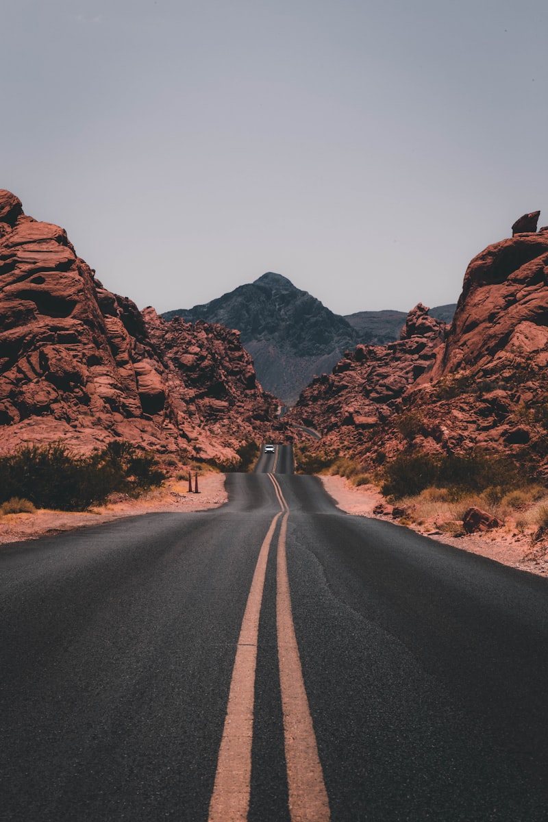
Frosted panel
Backdrop filters soften whatever is behind the element.
Code
<div class="relative h-40 overflow-hidden rounded-2xl border border-slate-200">
  <img src="https://images.unsplash.com/photo-1500530855697-b586d89ba3ee?auto=format&fit=crop&w=800&q=80" alt="Mountains" class="absolute inset-0 h-full w-full object-cover">
  <div class="absolute inset-0 bg-slate-900/30"></div>
  <div class="relative m-6 rounded-xl border border-white/20 bg-white/30 p-4 text-white shadow-lg" style="backdrop-filter: blur(18px) saturate(1.25);">
    <p class="text-sm font-semibold">Frosted panel</p>
    <p class="text-xs text-white/80">Backdrop filters soften whatever is behind the element.</p>
  </div>
</div>
Tips & Best Practices
- Ensure the element has a translucent background (
rgba,hsla) so the effect is visible. - Limit use on large scrolling regions due to GPU cost, especially on mobile devices.
- Pair with
backdrop-filterfallbacks (solid colors) for browsers that do not support the feature.
Accessibility & UX Notes
Maintain sufficient contrast after blurring backgrounds; rely on overlays to control brightness.
Browser Support
Supported in Safari 9+, Chrome 76+, Edge 79+, Firefox 103+. Legacy browsers ignore the property.
Related
-
filterfor applying similar effects to the element itself. -
mix-blend-modefor color blending approaches. -
background-colorwith transparency to reveal the filtered backdrop.